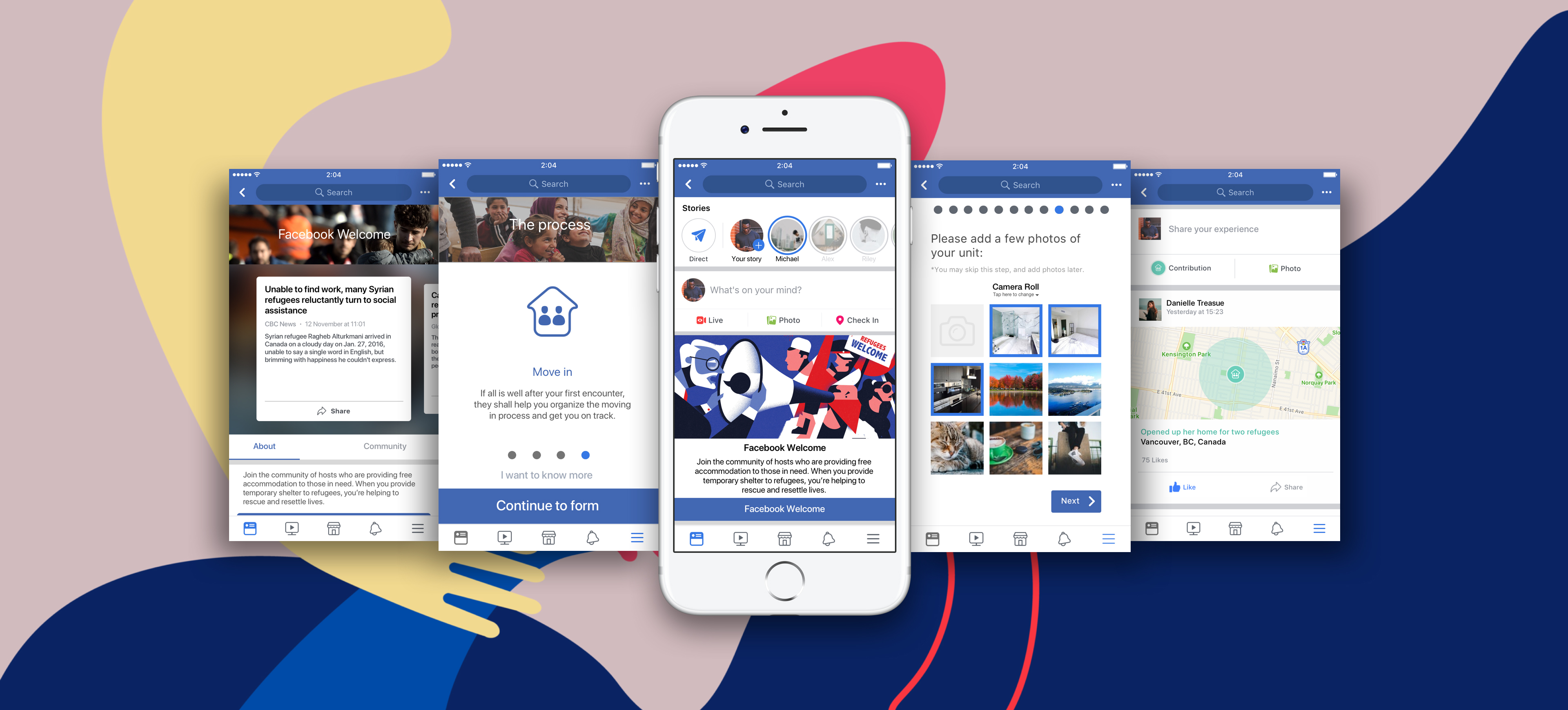
Facebook Welcome
Since the summer of 2017, Facebook has a new, more community driven, mission statement which is to ”give people the power to build community and bring the world closer together”. Shortly after this statement was delivered, Crisis Response was launched. This is a feature where users not only are able to find information about recent crises, but also allow users in the affected area to find and provide help, therefor aiding the recovery efforts.
Facebook's Crisis Response approach is reactionary, whereby it only goes into effect after a crisis occurs. We decided on leveraging this feature and designing a more proactive feature - Facebook Welcome. Welcome allows community members to engage and contribute by opening up their unused housing spaces and, temporary, offer housing to refugees for free. All with a few simple taps in their Facebook app.
Facebook Welcome is the result of a five-week school project I did together with two other students during my exchange year at Simon Fraser University, in Vancouver. The focus of the assignment was user research and prototyping, and the final deliverable was a working prototype.
What: User research / UX / UI When: November 2017 - December 2017
Research
We began the project by conducting thorough research on the refugee crisis. In interest of time, we had to limit the scope to the situation in North America. Given the political climate in America and current hostility received by refugees, there was a clear need to tackle the acceptance of diversity. The question we had to answer was: how do we create a service that provides asylum seekers a welcoming environment and a helping hand to integrate to the new community?
In order to strengthen our research, we conducted a semi-structured interview with Johanna, a volunteer working for Save The Children. This allowed us to gain further insights of our target audience as well as better understanding of the problem we had to solve. Because as she put it: ”I think a lot of people want to help, they just don’t know how to”.

Opportunties
Given the perspectives from Johanna we ideated on possible solutions to the problem. We boiled it down to three different opportunities, each aiding a certain pain point asylum seekers face once arriving in a new country.
- Providing more tools to individuals in a local community looking to play a role in this large global crisis.
- Easing the process of refugees integrating themselves within a new, foreign environment.
- Easing the tedious and stressful challenge of refugees trying to interact and understand the local government.
Utilizing Facebook
Lowering the threshold for people to help was crucial for us. We did not want to end up creating a brand new service where users would have to create yet another account, which probably would lower the conversion rate substantially. Instead we wanted to make use of the number one service we use for our communities today; Facebook. Facebook not only seemed like a perfect fit since they have a huge amount of active users but also since they already had started their work to do something greater for society with the launch of their Crisis Response feature, mentioned earlier.
User journey
When we had decided to try to integrate our solution to the current Facebook ecosystem, we began to map out a user journey, addressing key touchpoints. After having reached out to charity organizations currently trying to aid in the refugee crisis, it came to our understanding we would need some kind of form where users could provide necessary information not currently available in their Facebook accounts. Such as where they are living and how long they could open up their unused living space.

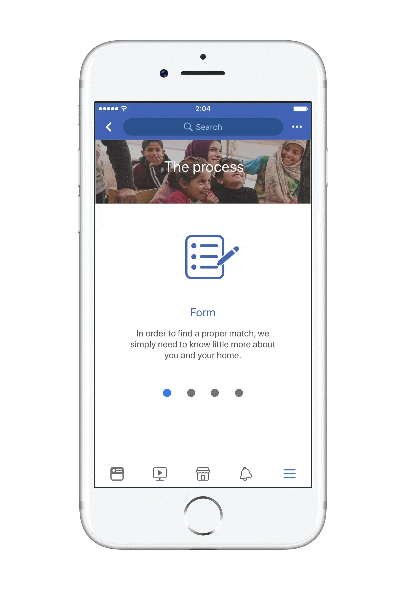
Final prototype
A big focus for the final prototype was to create a streamlined application process that did not feel overwhelming to users. Filling out the form is one of the major touchpoints in the user journey and we had to make sure it was seamless. We put a lot of efforts into trying to make it fun and we utilized the touch display medium for suitable data entries to avoid having only text inputs.
After user testing different designs of the form, it was proven that the version presenting one question at the time was more engaging and was perceived as less demanding cognitively, compared to having a traditional, one page form.