🚧Note: This case study is currently a work in progress. I am actively finalizing the tree testing synthesis and preparing the final taxonomy for engineering handover.
Brief
The rapid growth and optimization for time-to-market of ZEOS One, Zalando’s B2B multi-channel fulfillment portal, led to a fragmented user experience. Features were being shipped by 11 independent teams without anyone responsible for the holistic experience, resulting in a disconnected and scattered navigation that confused merchants.
I led the end-to-end strategic redesign of ZEOS One's navigation and information architecture. My objective was to break down internal silos, audit over 70 current and upcoming capabilities, and establish a scalable, merchant-centric taxonomy. I delivered a unified architecture and sign-off process that now guides all future product development across the ZEOS ecosystem.
Team
Design & User research: Alecio Calixto, Liang Hiah, Nina Jurcic, Lekan Isaac, Wyndham Mead, Oscar Fredriksson.
The problem wasn’t just that merchants couldn’t find information. The real problem was that the organization had no alignment, nor a holistic perspective of how information should be structured in a scalable manner.
In alignment with Conway's Law, the legacy navigation wasn't designed for user flows—it was a byproduct of the ZEOS org chart. The interface had fragmented into isolated silos, perfectly mirroring the distributed engineering teams that built them. To fix the UX, we first had to break the mental link between "Team Structure" and "Site Structure."
Organization
ZEOS
Partner Tech
Wholesale
Navigation
Multi-Channel Orders
Zalando Orders
Articles
Architecting the Long-Term Vision
It is important to note that a complete architectural overhaul of an enterprise platform doesn't happen overnight. We needed a "North Star" — a long-term vision to guide our immediate design decisions and pave the way for the future, even if fully realizing this architecture will take significant time.
We established four cornerstones to act as the foundation for the new portal structure proposal:
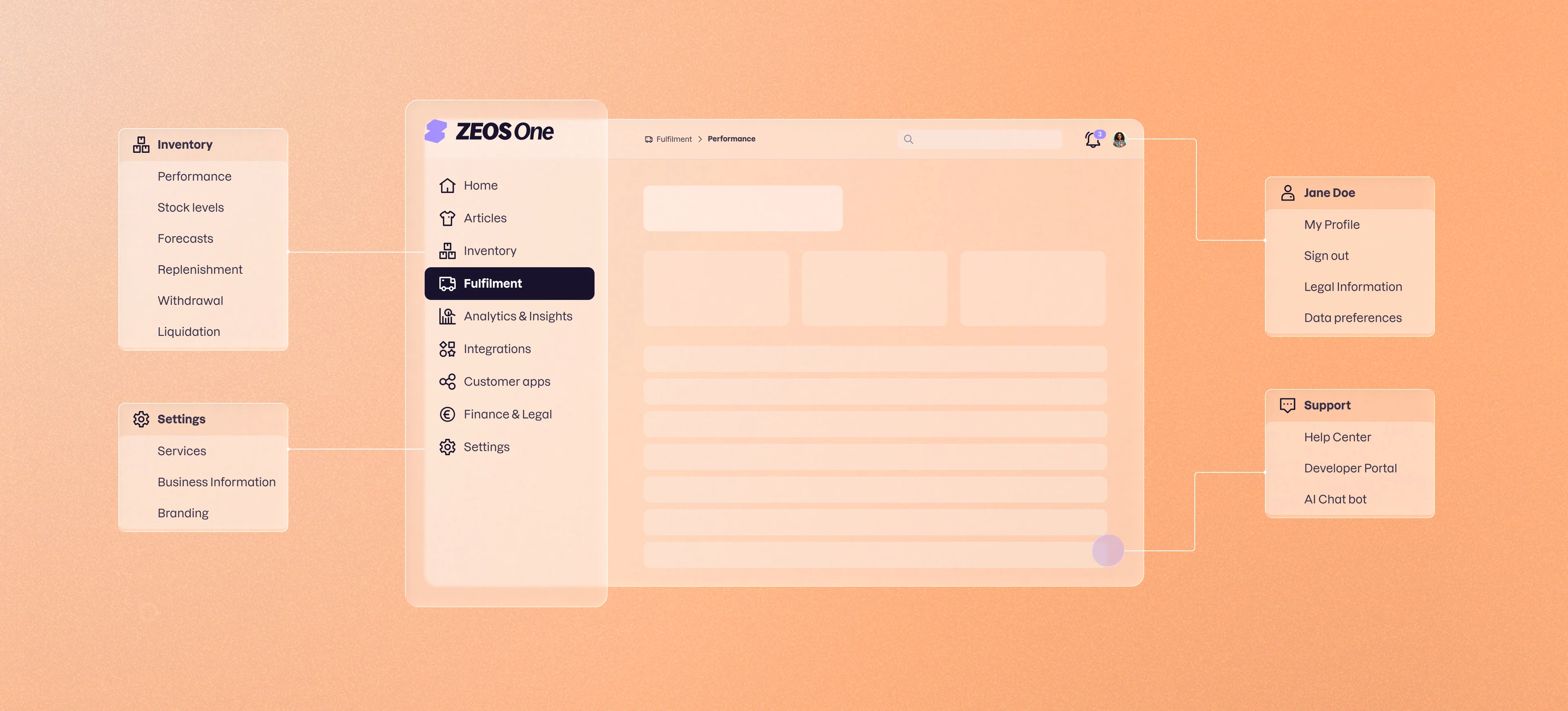
Object-Oriented UX (OOUX): Shifting the portal's navigation away from single features or actions and centering it around the core entities our merchants actually care about (e.g., Articles, Orders, Shipments, Returns, etc.).
Establishing Relationships: Objects have relationships that need to be reflected in the information architecture. For example, a customer order contains items that will be taken from point A to point B via a shipment. As a user, it should be possible to view these relationships and use them as a means to navigate to different sections of the portal.
Leading with Insights: We show the current state of the core objects before inviting users to take actions on them. More specifically, the landing page of each main section will be a dashboard showing insights and alerts around current performance.
Modular Building Blocks: The Information Architecture must adapt to the nature of our different merchants. For example, some merchants will only use our shipping or returns services, and not store any of their articles in our warehouses. For these merchants, it makes little sense to see an Inventory or stock management section in the main navigation of ZEOS One.
Project Timeline
Q4 2025
Competitor Analysis
Feature Audit (current + future)
Sacrificial Information Architecture
Stakeholder Workshops
End-user Tree Testing
Synthesise & Revise
Draft Roll-out Plan
Sitemap & Handover
Q2 2026
The Feature Audit
We cataloged over 70 unique feature requirements from legacy systems, creating a "sacrificial" backlog to identify grouping patterns.
Traditional wireframing is too static to evaluate a complex navigational overhaul, especially when anchors and relationships are key aspects of the concept. Building an interactive, high-fidelity prototype manually in Figma would have delayed the project by weeks.
To bypass this bottleneck and keep momentum, I leveraged AI-assisted prototyping to rapidly generate a functional, clickable portal that could be iterated on quickly. This allowed stakeholders across all product teams to actually experience the new architecture, instantly shifting the conversation from theoretical taxonomy debates to practical, unified alignment.
The interactive component below demonstrates the ruthless auditing of our main navigation. We removed redundant technical features, surfaced new core objects and aligned the terminology with merchant expectations.
DashboardHome
Articles
FulfilmentInventory
OrdersOrders & Returns
Lifecycle Management
Analytics & Insights
Integrations
Applications
Finance & Legal
SettingsBusiness Admin
My profile
Documentation
API Clients
Event Subscriptions
Task 6 of 7
You need some of your stock currently stored at ZEOS to be sent back to your own warehouse. Where would you go to request these items back?
Articles
PerformanceSelect
CatalogSelect
Size & FitSelect
Inventory
PerformanceSelect
Stock LevelsSelect
ForecastsSelect
InboundSelect
Stock ReturnsSelect
Orders & Returns
Customer OrdersSelect
Customer ReturnsSelect
ShipmentsSelect
Recovery
RefurbishmentSelect
LiquidationSelect
Analytics & Insights
TrendsSelect
ReportsSelect
Selection Recorded
You chose: ...
In our actual tree testing survey, much like now, users didn't receive feedback on whether their choice was "correct" or not. The purpose was simply to tap into their mental model.
Validating with Tree Testing
To validate our proposed architecture, we conducted a quantitative tree test with active merchants. Stripping away the UI to force reliance on category labels revealed three pivotal insights:
Importance of Anchors: Merchants overwhelmingly preferred initiating actions in-context, directly from an object's view (e.g., triggering liquidation from "Stock Levels") rather than from the dedicated Liquidations sub-page.
Decentralizing Analytics: 73% of merchants found high value in breaking apart the monolithic "Analytics" hub into dedicated "Performance" landing pages for the main object sections.
Course-Correcting Terminology: Our attempt to rebrand stock returns as "Withdrawals" failed, proving that descriptive, legacy naming conventions aligned much closer to merchant mental models.
Relying on this behavioral data, rather than internal stakeholder preferences, helped ground our changes and proposal.
Milestone 1
To manage the transition towards the long-term vision and revised navigation without breaking legacy workflows, we established a phased roadmap. For Milestone 1, we prioritized immediate UX wins: renaming and cleaning up the top-level sections to match the merchant mental model. For highly specialized legacy features that couldn't yet fit the new object model, we established temporary "bridge" patterns to keep them accessible until they are fully absorbed.
Evolution of the main nav.
Translating the conceptual architecture into a phased rollout, breaking down the legacy silos into a scalable, object-oriented ecosystem.
Before
Dashboard
Orders
Fulfillment
Documentation
Settings
API Clients
Event Subscriptions
Non-compliance
Milestone 1
Home
Articles
Inventory
Orders & Returns
Integrations New
Business Profile
Longterm
Home
Articles
Inventory
Orders & Returns
Lifecycle Management New
Analytics New
Finance & Legal New
Integrations
Customer apps New
Business Profile
The Road Ahead
Milestone 1 successfully stopped the bleeding, but realizing the full Object-Oriented UX vision is a marathon, not a sprint. We are currently working closely with domain PMs and engineering teams to incrementally transition legacy pages into the new architecture, ensuring we reach our North Star without disrupting the daily operations of our merchants.
TL;DR
I co-led the strategic overhaul of the Information Architecture for ZEOS One, uniting 11 fragmented product teams under a single, merchant-centric mental model to prepare the platform for massive scale.
Strategic Auditing: Cataloged and synthesized over 70 disparate features across 26 PMs to identify core usability bottlenecks.
Overcoming Conway's Law: Transitioned the platform from an org-chart-driven navigation to an Object-Oriented UX (OOUX) model based on four core design principles.
Rigorous Validation: Utilized quantitative tree testing to secure cross-functional buy-in to decentralize analytics and anchor actions contextually.
Accelerating Alignment: Leveraged AI-assisted prototyping to bypass traditional wireframing bottlenecks, getting executive alignment in record time.
Phased Rollout Strategy: Navigated complex internal politics by delivering a two-phased roadmap, ensuring immediate UX improvements (Milestone 1) without breaking legacy infrastructure.