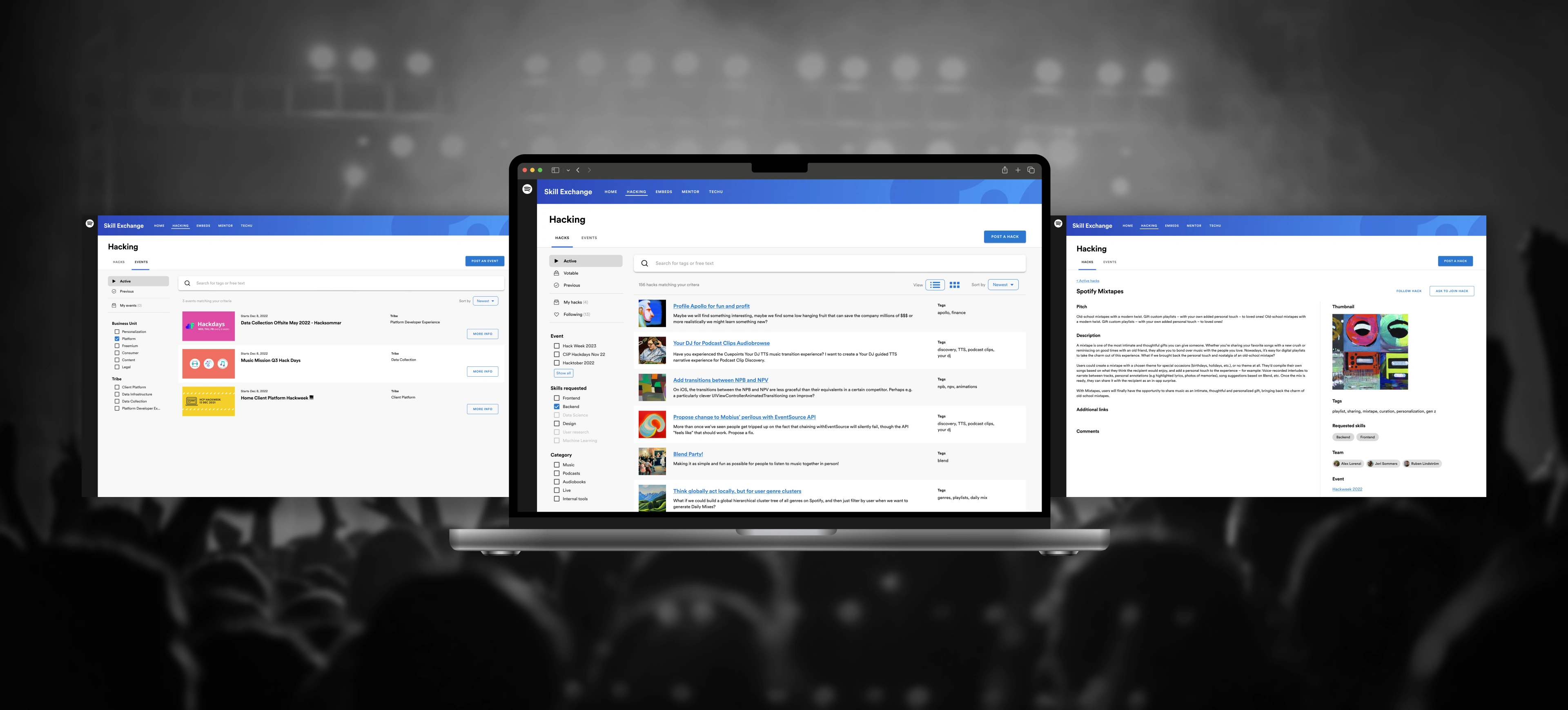
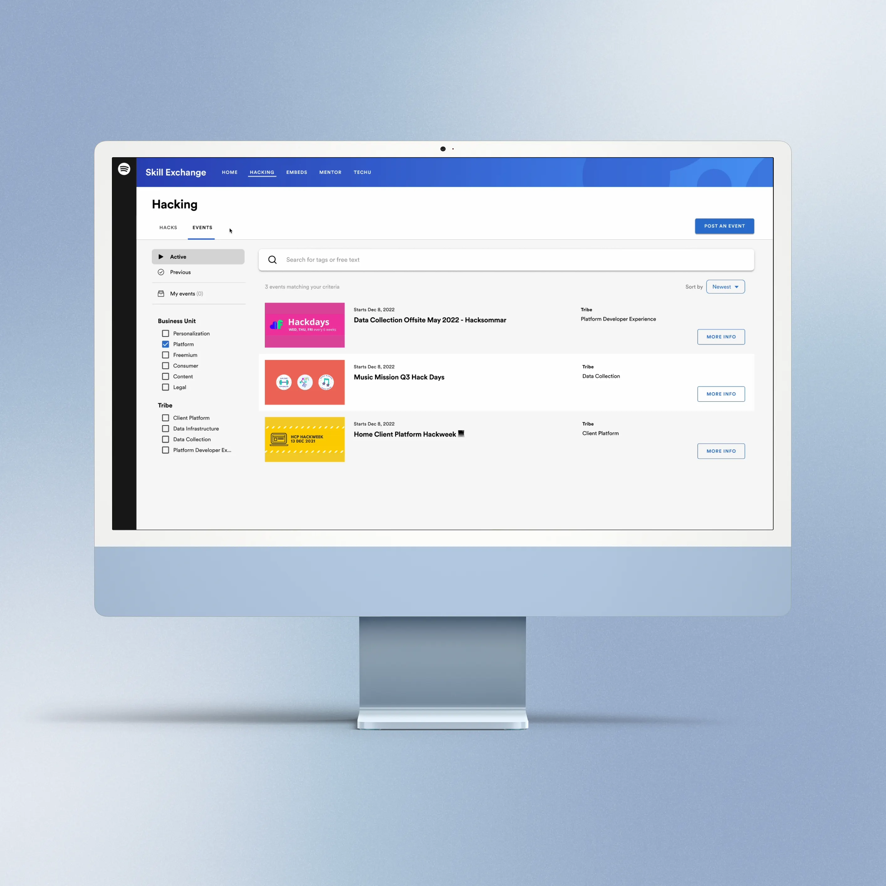
Hacking is the heartbeat of Spotify's engineering culture. It is the exact incubator that birthed beloved features like Discover Weekly and Wrapped in the Spotify app. Within Skill Exchange, Spotify's growth and upskilling platform in Backstage, the Hacking section serves as the central marketplace for engineers to pitch new ideas, recruit talent and collaborate.
However, the legacy platform was failing. As the lead designer, I spearheaded the end-to-end redesign of this experience. The challenge was twofold: rescue Spotify's internal collaboration ecosystem, and architect the platform to be successfully commercialized as an external Backstage plugin for other global tech companies.
Team
Design & User research: David Jost, Hannah Limerick, Oscar Fredriksson.
Product & Engineering: Morgan Da Costa, Vojta Burian, Alex Lorenzi, John Philip, Jackson Chen, Sydney Achinger, Bond Yan, Matthew Klubeck.
The Hacking section hadn't been touched since 2019, and our quantitative data showed it was actively working against us. We weren't just looking at a stale user interface; we were facing a failing ecosystem.
Broken Discoverability: The feed was a graveyard of duplicated posts, and legacy filters were ineffective at helping users find relevant projects.
The 'Solo Hacker' Spike: Our biggest alarm bell was a significant increase in single-person projects. The UX was so overwhelming that users stopped trying to recruit cross-functional teammates, defeating the entire collaborative purpose of the tool and our annual, company-wide, Hack Week.
Diagnosing the Friction
To understand why our experience was failing and why collaboration was breaking down, I partnered with my PM to run a rapid research sprint. We interviewed 9 users across different disciplines and tenures, using affinity mapping to synthesize the pain points.
Lack of Pitch Standards: Project creators didn't know how to capture the essence of their ideas, leading to walls of text that failed to explain what skills they actually needed and to attract hackers.
Missing Visual Expression: The platform felt like a sterile enterprise IT tool, heavily contrasting with Spotify's highly visual, playful consumer brand.
Broken Filtering: The available filters and sort options were outdated and did little to help users find projects of interest.
Mapping the Emotional Lifecycle
To visualize the exact drop-off moments, I mapped the emotional lifecycle of a Spotify engineer looking for a hack project. The data revealed a massive friction point during the Consideration phase.
Users entered the Skill Exchange platform excited by the company-wide Hack Week announcements, but were immediately hit with cards of different sizes and structure screaming for attention when trying to browse the feed, shifting their emotion from "Excited" to "Overwhelmed." Fixing this critical phase of the journey became my primary mission.
Actions
Touchpoints
Experience
1. Awareness
Actions
See email announcement of Hack days or Hack week.
Go to Hacks section in Skill Exchange.
Touchpoints
Email CTA / links on Workplace / Slack posts.
Skill Exchange plugin.
Experience
🤩
Excited
2. Consideration
Actions
Browse and find a hack that piques my interest.
Check if my idea already exists/has been hacked on in the past.
Touchpoints
Pagination.
Filters.
Search bar.
Experience
😰
Overwhelmed
3. Decision
Actions
Ask to join hack.
Post hack idea.
Comment and ask questions about hack.
Touchpoints
CTA buttons in UI.
Create flow.
Experience
😎
Eager + Optimistic
4. Retention
Actions
Follow/join hack to get updates.
Post status updates to keep others informed.
Touchpoints
Detailed page of hack.
Comment section.
Edit page.
Experience
😳
Pressured + Curious
Fixing the Atomic Unit
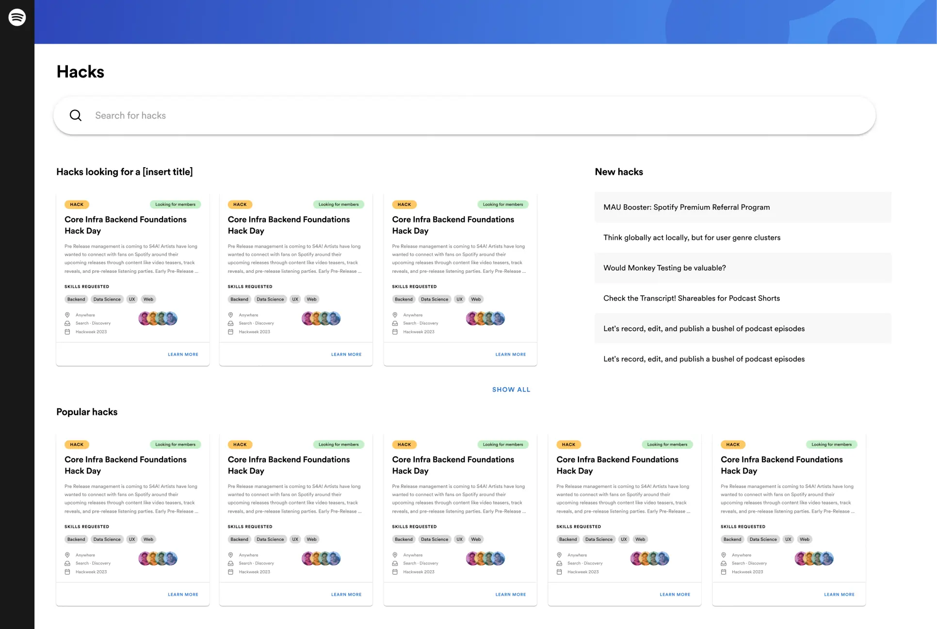
My initial approach focused on redesigning the platform's core element: the 'Hack Card'. The legacy design suffered from poor information hierarchy and color coding, making it difficult to parse relevant information. I re-architected the card anatomy by introducing strict categorical tagging, a dedicated "Requested Skills" pill section (that could be filtered for) and clear visual indicators for projects actively seeking members. In isolation, the new design was a massive upgrade in clarity and data density.
Old card design
No habla Makefile: A Go lib to execute shell script tasks
Why use Makefile in 2022? Is your repo full of randomly growing untestable shell scripts?
Pre Release management is coming to S4A! Artists have long wanted to connect with fans on Spotify around their upcoming releases through content like video teasers.
However, enterprise product design doesn't happen in a vacuum. When we populated a live prototype with the new cards, a critical flaw emerged: contextual clutter. Placing dozens of data-heavy cards side-by-side created an exhausting "wall of UI" that actively slowed users down.
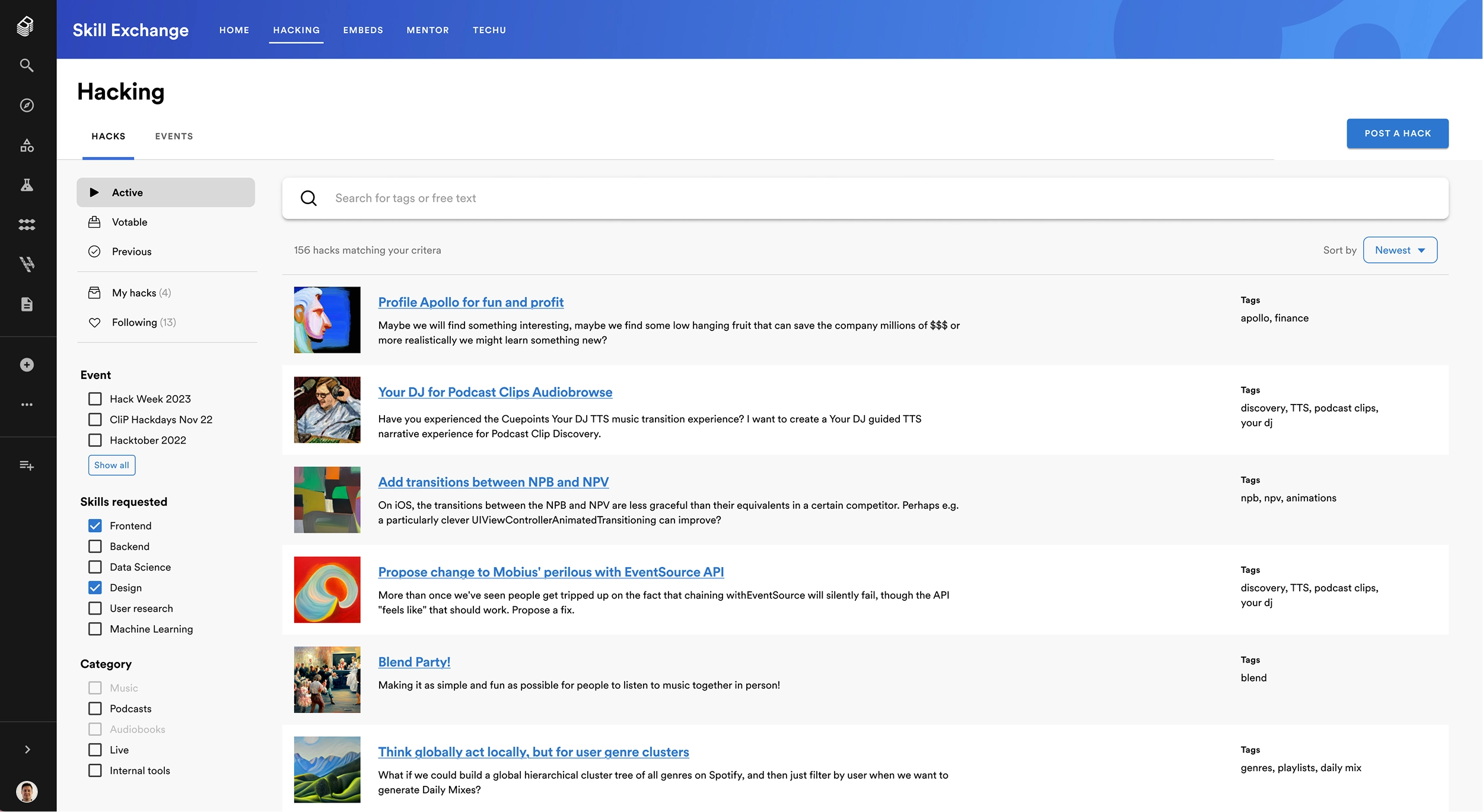
For engineers needing to scan hundreds of projects in seconds, this friction was unacceptable—and it was directly contributing to the isolated "solo hacker" trend. I ruthlessly scrapped the grid concept and pivoted to a high-density list architecture. By stripping away heavy containers and condensing metadata, we prioritized rapid scannability and removed the friction blocking cross-functional team formation.
Evolution of Hack list item
Use the slider to see the transition from simple text lists to generative AI visuals.
Profile Apollo for fun and profit
Maybe we will find something interesting, maybe we find some low hanging fruit that can save the company millions of $$$ or more realistically we might learn something new?
Your DJ for Podcast Clips
Have you experienced the Cuepoints Your DJ TTS music transition experience? I want to create a Your DJ guided TTS narrative experience for Podcast Clip Discovery.
Add transitions between NPB
On iOS, the transitions between the NPB and NPV are less graceful than their equivalents in a certain competitor. Perhaps e.g. a particularly clever UIViewControllerAnimatedTransitioning can improve?
Text OnlyIdenticonGen AI
Solving the Cold-Start Problem
A major barrier to team formation was project presentation. Engineers often submitted brilliant ideas as dry walls of text, which failed to attract collaborators and stifled platform engagement.
Instead of forcing engineers to become marketing experts or designers, I led the integration of a generative AI image pipeline. This system dynamically generated unique, vibrant artwork based purely on the project's title. This didn't just inject Spotify's signature visual joy into a B2B interface—it completely eliminated the cold-start friction for project creators, instantly transforming a sterile database into a high-conversion project marketplace.
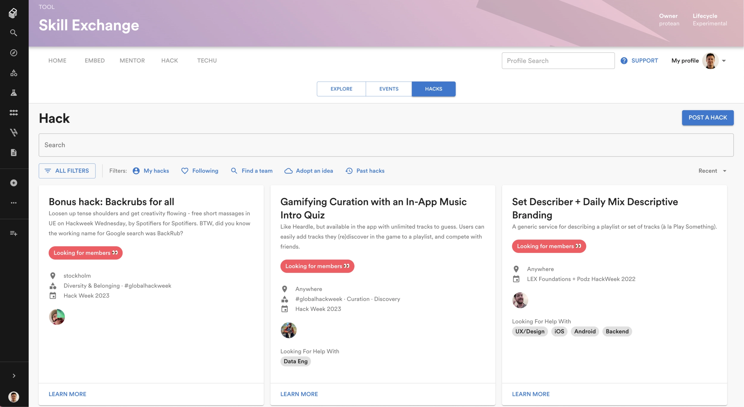
Enterprise-Grade Discovery
Knowing this platform was destined for commercialization, the architecture had to scale beyond Spotify's internal quirks. I coupled the new scannable list view with a robust, faceted filtering engine. By allowing users to drill down by specific disciplines, timezones, and project statuses, we turned a chaotic feed into a hyper-efficient discovery engine ready for external enterprise deployment.
Before
After
Commercial Scale & Impact
The redesigned Hacks platform didn't just rescue Spotify's internal Hack Week; it proved robust enough to be packaged and sold as a premier B2B enterprise product.
Commercial Expansion: Architected the UX to scale beyond Spotify, successfully commercializing the Skill Exchange plugin with major external partners in the US, including Shutterstock, Peloton, and SeatGeek.
Ecosystem Contribution: As a foundational pillar of the broader Skill Exchange platform, this redesign contributed directly to our macro goal, helping drive an approximate 15% reduction in first-year attrition among internal Spotify users.
Frictionless Discovery: By moving from cluttered cards to AI-enhanced lists and robust filtering, we eradicated the "wall of text" problem and successfully reversed the spike in isolated solo hackers.
TL;DR
As the lead designer, I spearheaded the end-to-end redesign of the Hacking section within Spotify's Skill Exchange platform, rescuing a failing internal collaboration ecosystem and successfully scaling it into a commercial, revenue-driving B2B product.
Commercial Transformation: Architected a scalable UI foundation that enabled the platform to be packaged and sold as a premier enterprise Backstage plugin to external tech giants like Peloton, Shutterstock, and SeatGeek.
Strategic UX Pivots: Prioritized rapid discoverability over aesthetic trends by ruthlessly scrapping initial card designs in favor of a high-density list architecture, solving cognitive overload.
AI-Driven Engagement: Spearheaded the integration of a Generative AI visual engine, automatically transforming dry project titles into vibrant artwork to solve the "cold-start" problem for engineers pitching ideas.
Macro Business Impact: Delivered systemic design improvements that drove project engagement, acting as a core driver for the broader Skill Exchange platform's success in reducing first-year internal attrition by ~15%.